3D Editor Rendering Optimization
Context
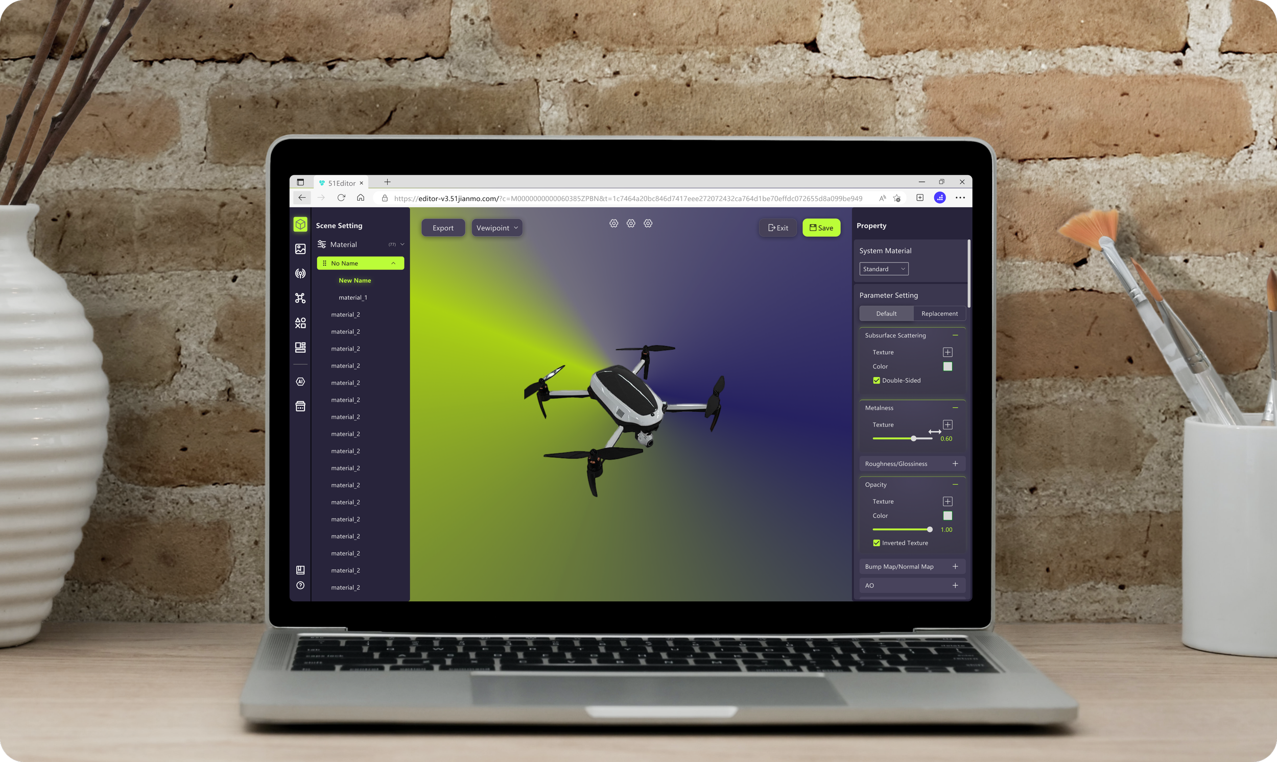
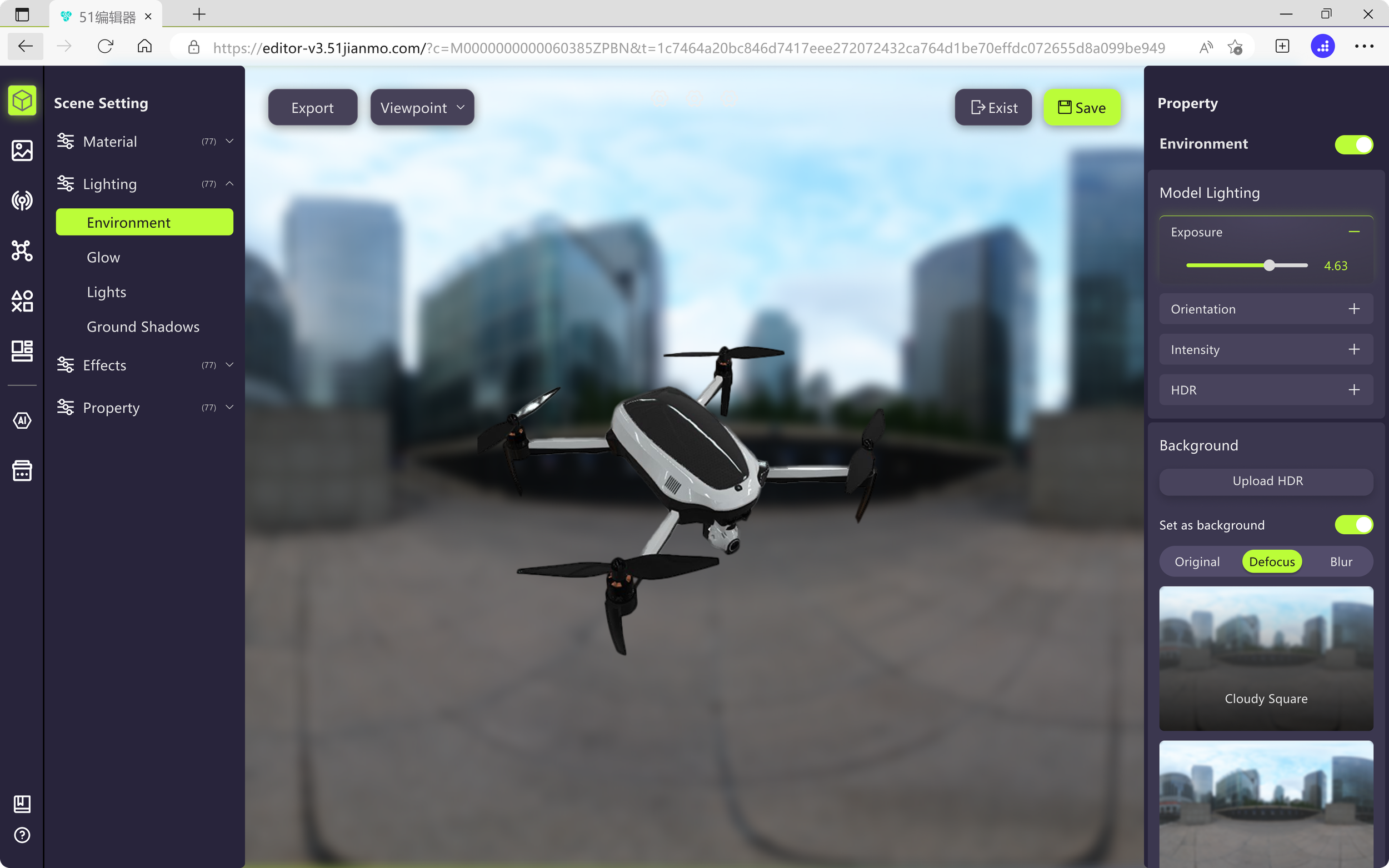
51 Rendering 3D Editor is a 3D modeling editor designed specifically for 3D modeling specialists. This tool enables users to render their 3D models with ease and convenience. The goal of this product is to continuously improve the user experience, providing advanced features and functionalities that cater to the evolving needs of 3D artists and designers.
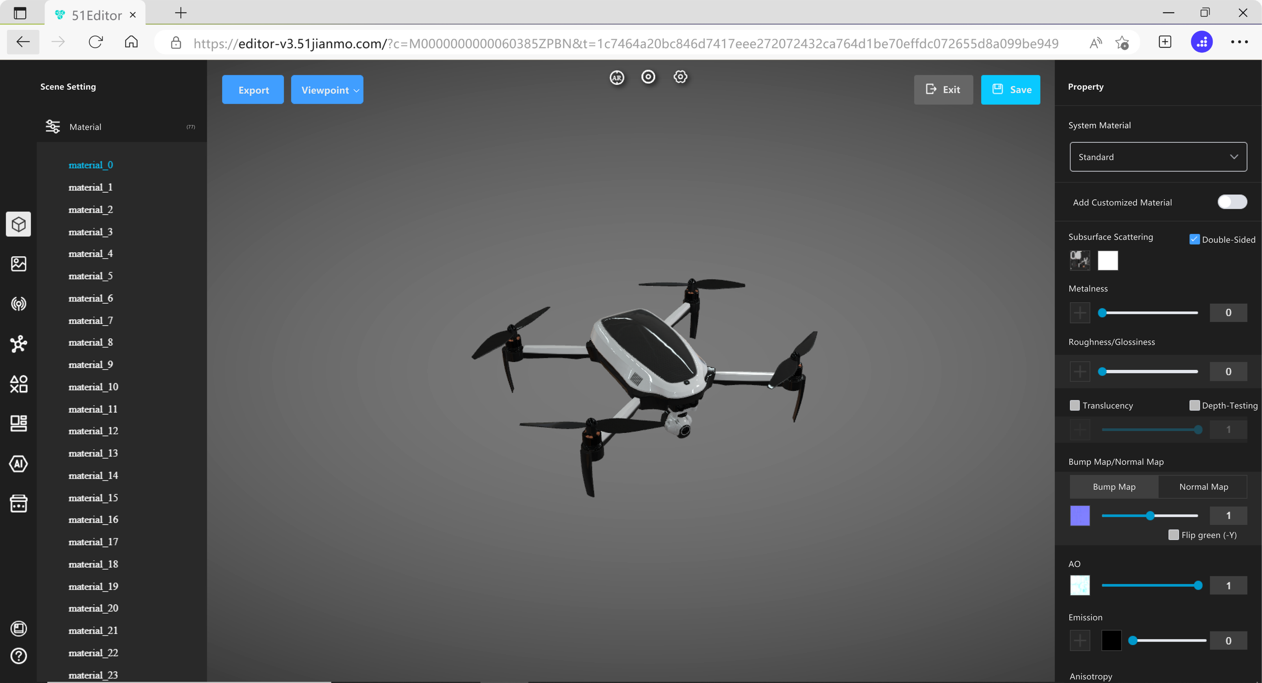
Original Editor UI
Business Goal
Design Goal
Intuitive Information Architecture
Organize the layers of materials into different groups, then adjust selected layer’s parameters
Customized Rendering Feature
Add a new set of parameter rendering options for the 3D model, allowing easy switching with a simple click on the tab or color ball
End Result
Role
UIUX Designer, June 2024 - August 2024
Team
3 Developers, 1 Product Manager, 1 UIUX Designer
Contribution
Heuristic Evaluation, 60 Interfaces, Design Systems Components
Overview
Optimize the original user interface to be more intuitive
Improve the customized material feature
Change the theme color to be more eye-catching
To address business goal #1: Make the original UI into the form of a “Modular UI”
To address business goal #2: Deconstruct the original switch to an explanatory and descriptive button for enhancing users’ understanding
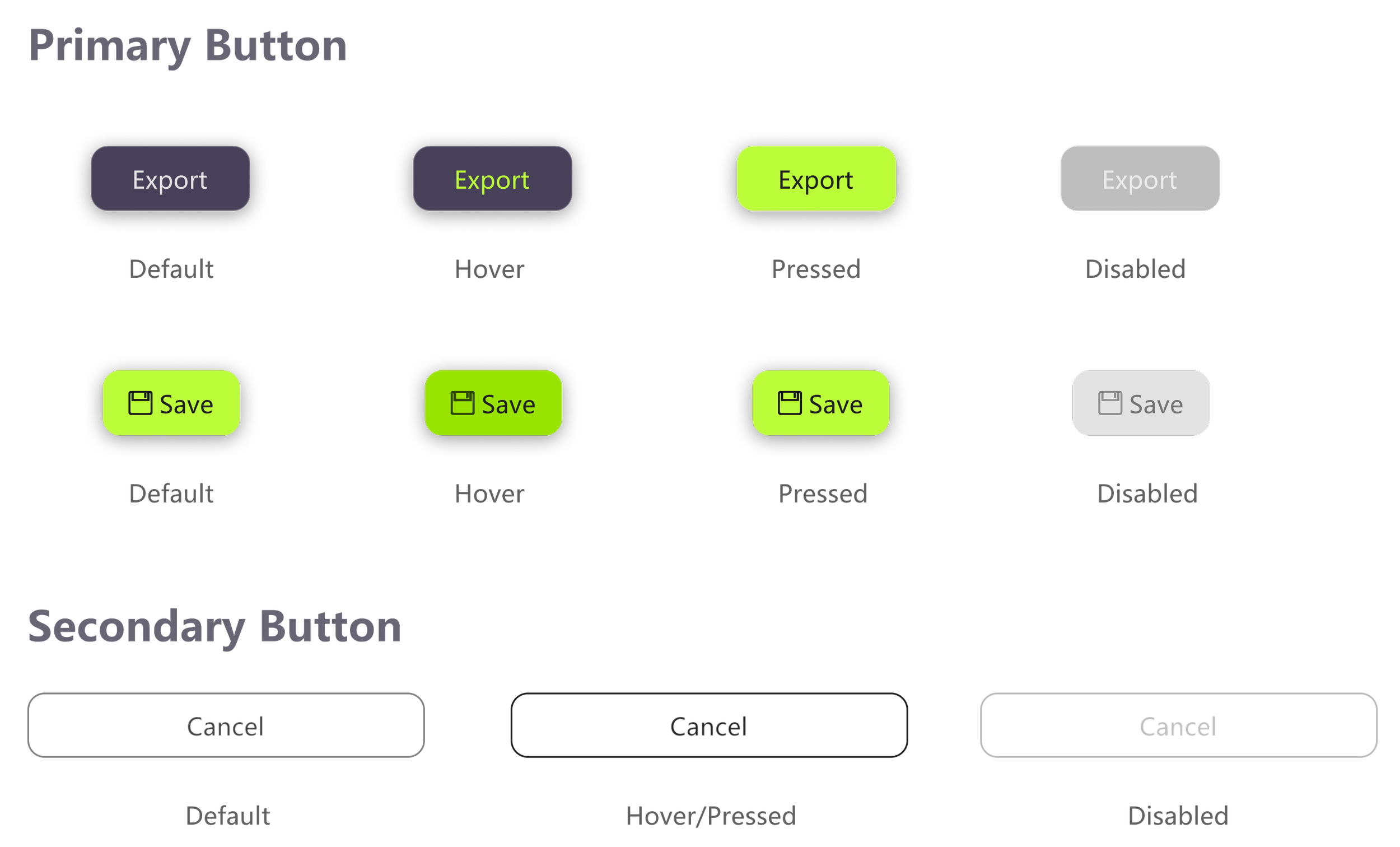
To address business goal #3: Change the original theme color to a more vibrant RGB style color

Discovery
Insights from Heuristic Evoluation
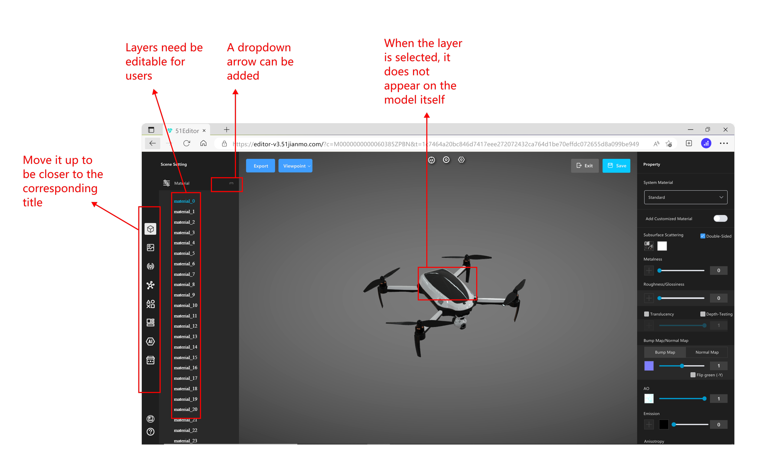
Information Structure: The organization of information lacks clarity, leading to navigation issues.
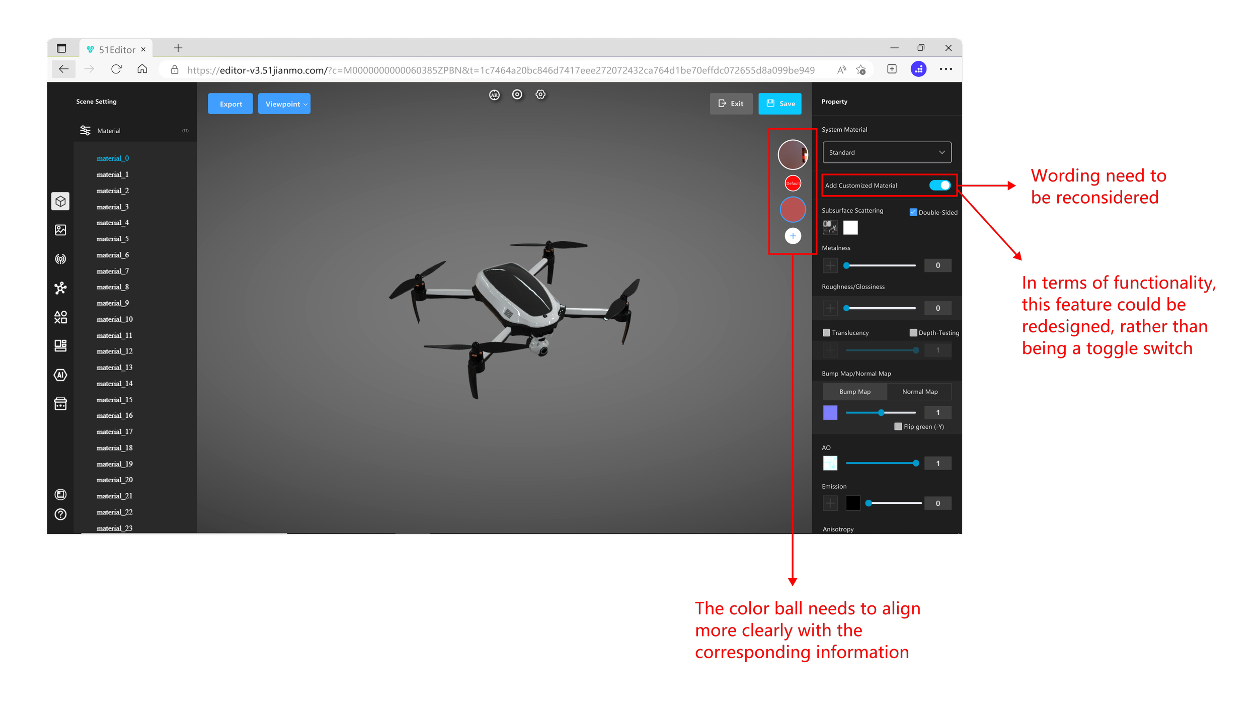
Feature Refinement: Some features lack clear user guidance, making it difficult for users to understand how to use them effectively. The choice of words needs to be reconsidered.
Design System: Need to add consistency and updated the UI to align with the business goal of enabling theme color and style changes.
Ideation & Design
Information Structure #1
Information Structure
Materials Layers Organization
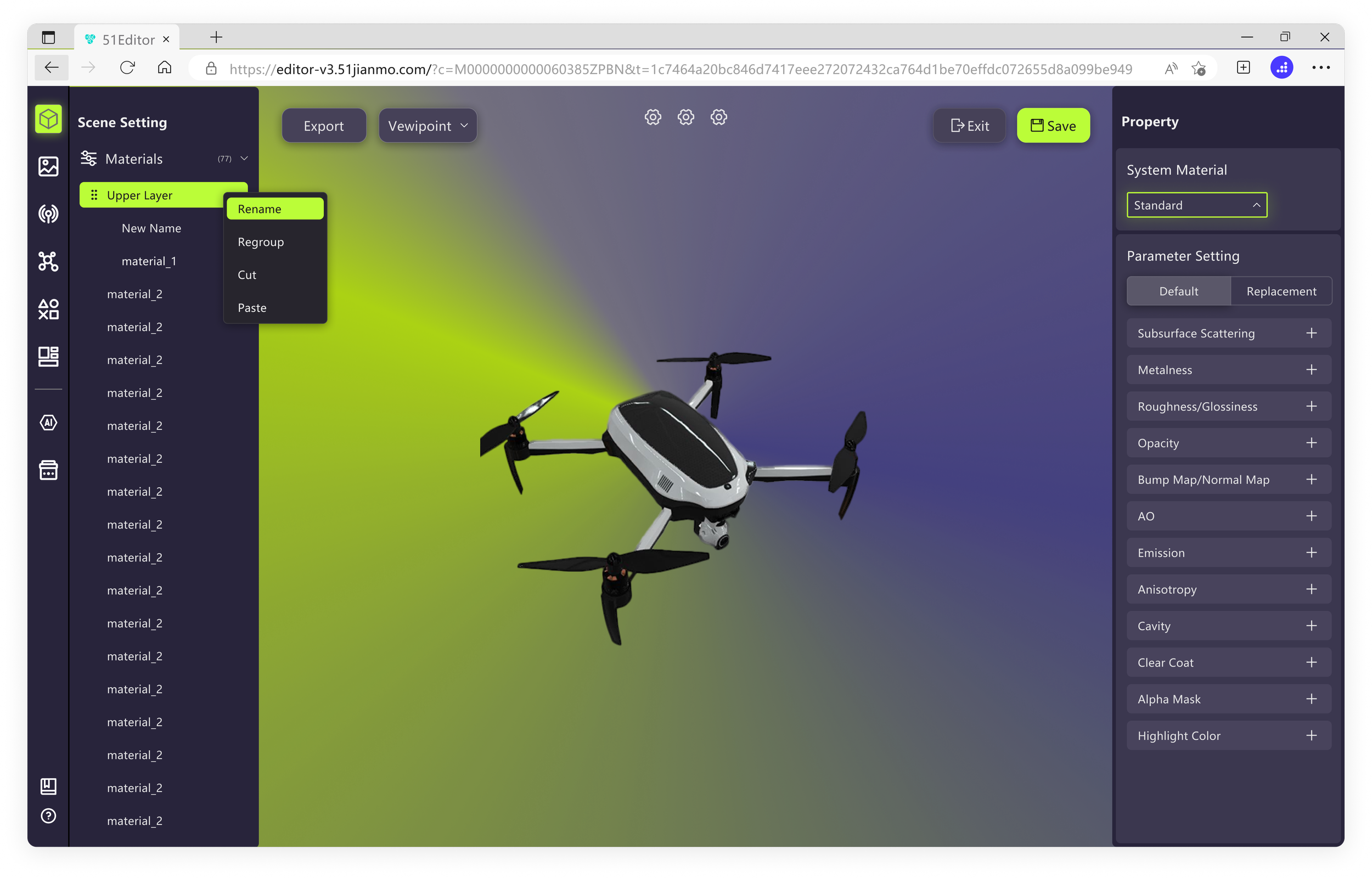
Problem: In the Materials section, users cannot organize or rename the different layers they upload, leading to potential confusion during their rendering process.
Solution: Implement a right-click menu that allows users to group layers, as well as rename both layers and groups, making them more organized and clearly labeled.
Before
V1.1: Materials cannot be organized by usersAfter
V1.2: Materials can be renamed, regrouped, or dragged by users
Information Structure #2
Hieraricial Relationship
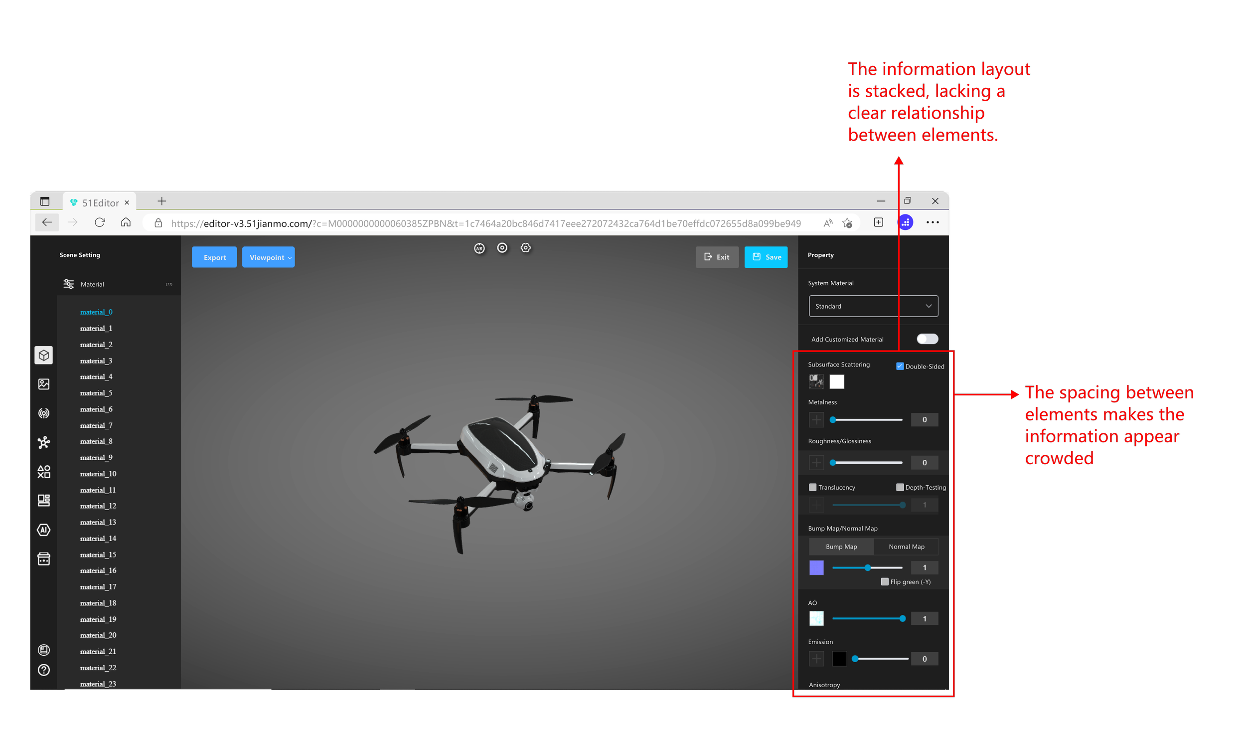
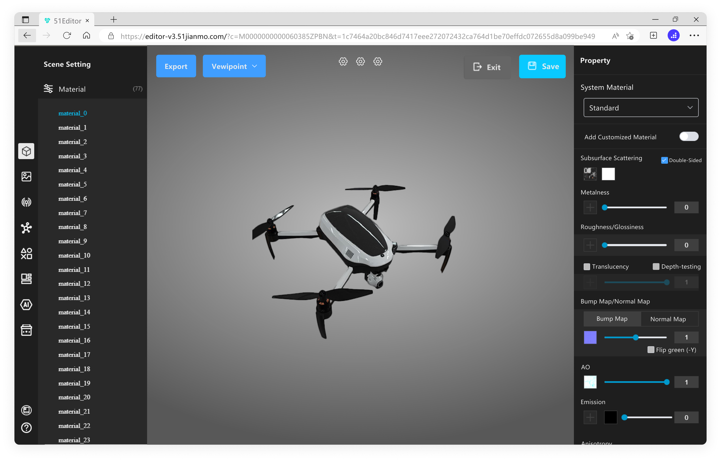
Problem#1: The original editor's information is arranged in a vertical, linear flow, making the hierarchical relationships between the information not intuitive.
Solution#1: The optimized version uses a modular vertical arrangement, highlighting the information hierarchy and functional relationships more clearly.
Problem#2: Some necessary naming are missing in the property section.
Solution#2: The optimized version aligns the functions with their respective names, ensuring that no essential details are omitted.
Before
V1.1: Various elements are stackedAfter
V1.2: Modular layout organizes the information with clarityFeature Refinement
Feature Refinement#1
Customized material feature
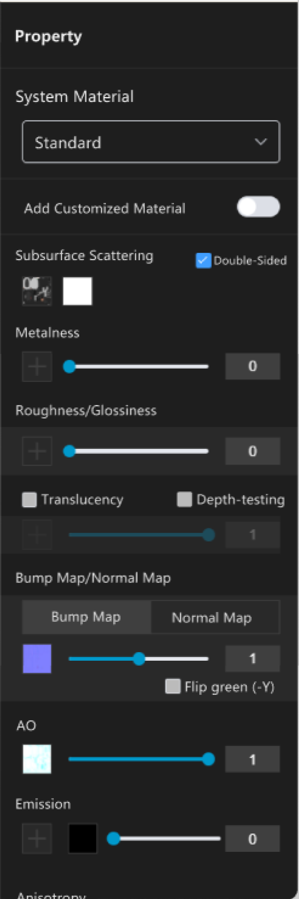
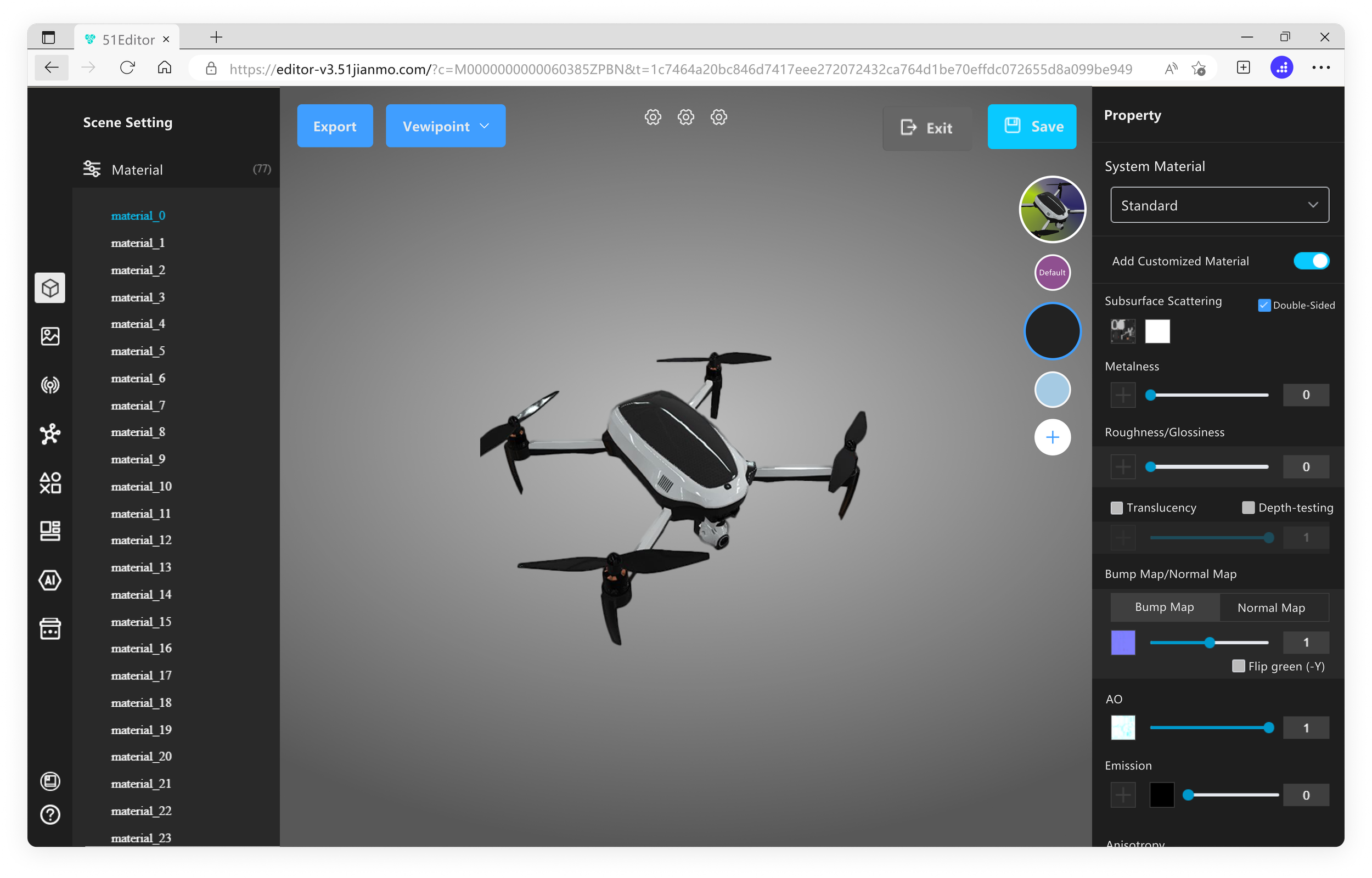
Problem: The customized material feature in the original editor is presented as a toggle switch—off for the default material set and on for the replacement material set. However, the information lacks clear direction, and there is a risk that users may lose their replacement material if they turn off the switch, making it difficult to understand how it aligns with the corresponding feature.
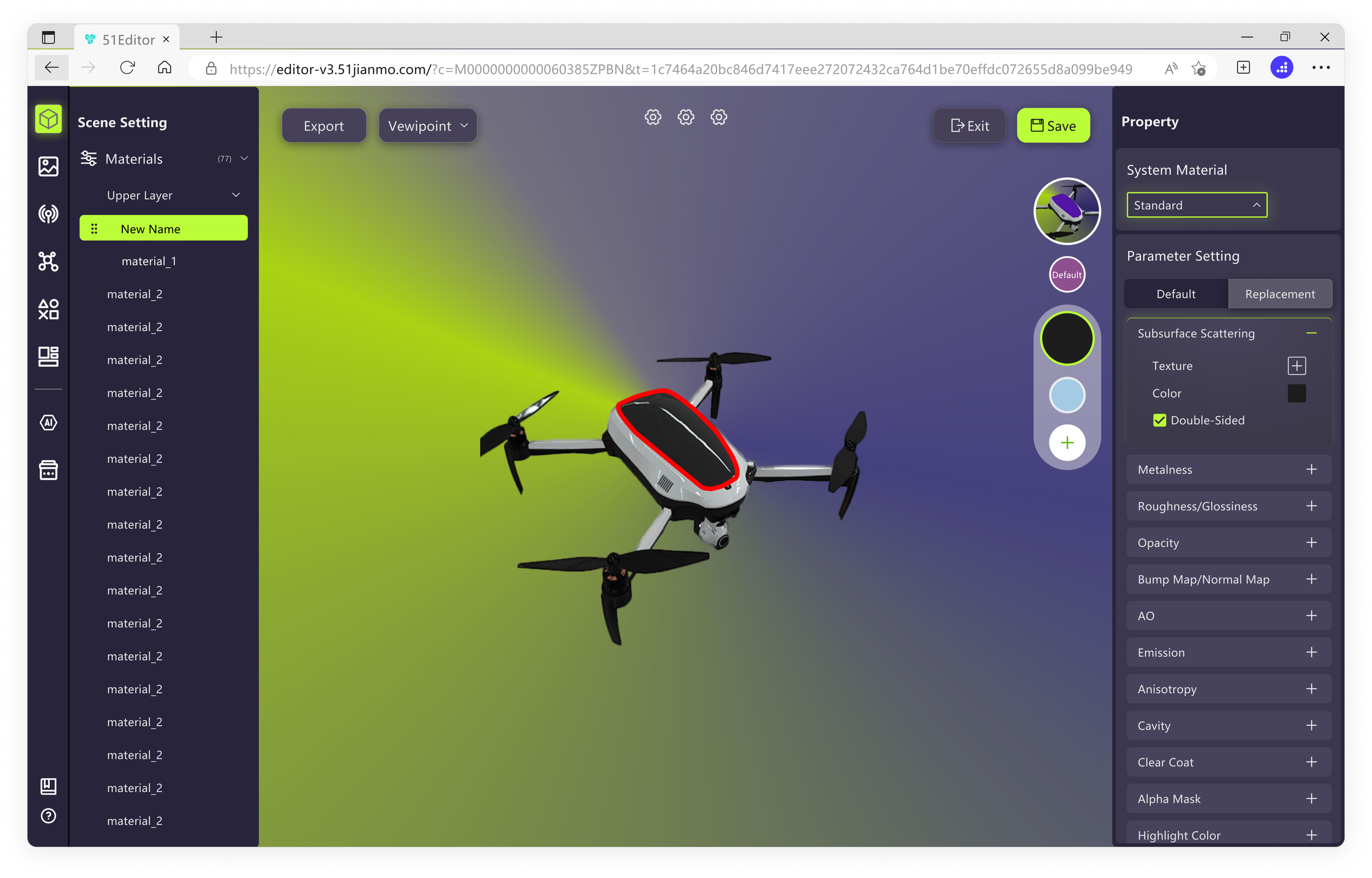
Solution: The optimized version separates the default and replacement materials into two different tabs, aligning them with the color balls and parameter adjustments below for better understanding.
Before
V1.1: Information lacks directionAfter
V1.2: By grouping replacement material ball to match the info
Feature Refinement#2
Environment Setting
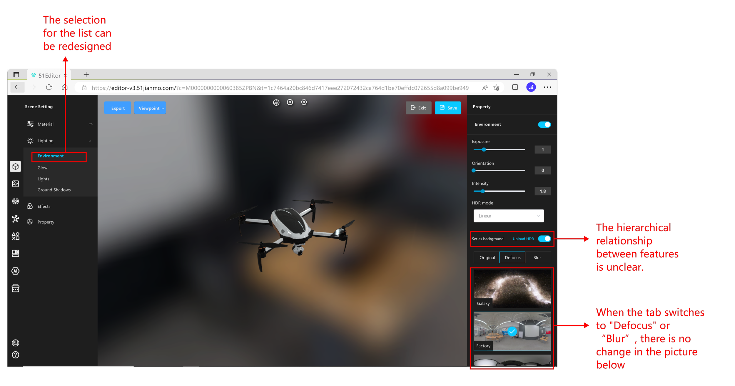
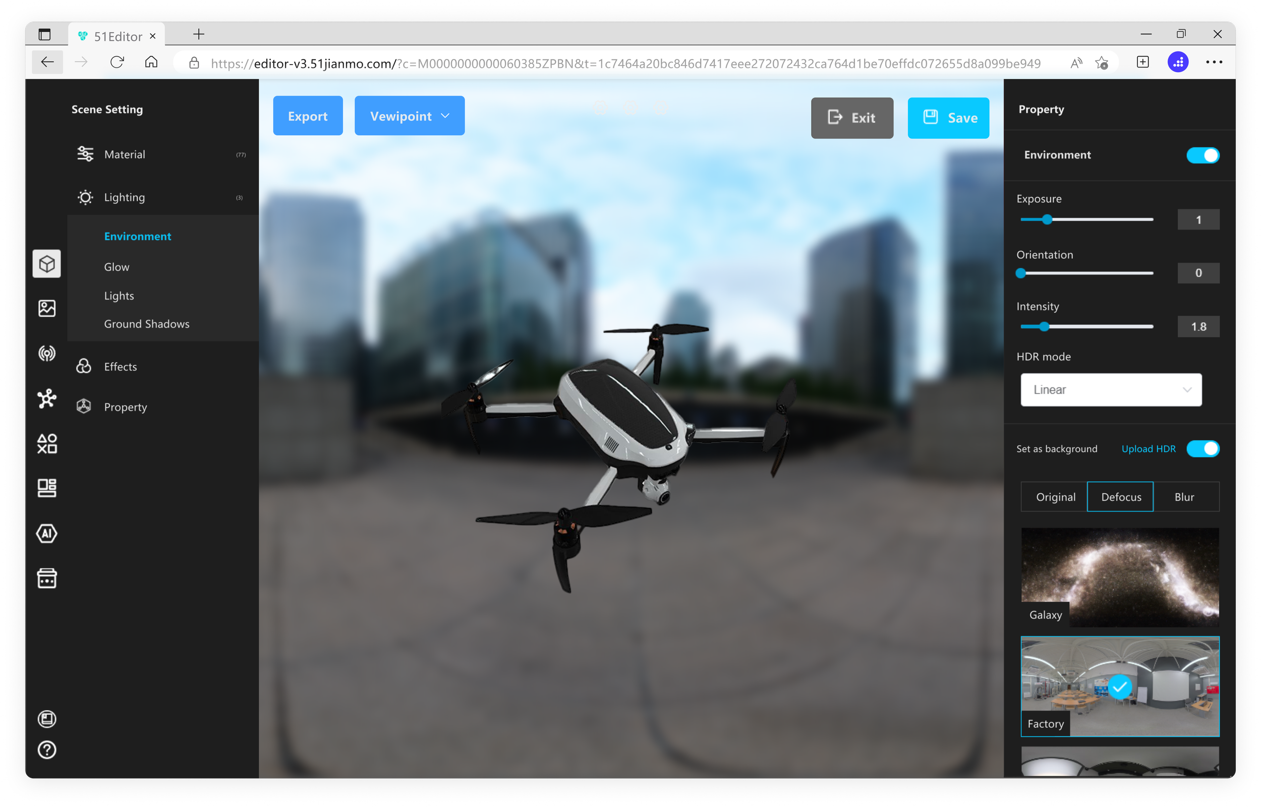
Problem: In the original editor, when changing the background, moving the slider does not cause the images below to reflect the effects of the change. Instead, the change only affects the background in the central area of the editor.
Solution: In the optimized version, moving the slider updates the images below to display a preview of the applied effects.
Before
V1.1: Background pic preview doesn't not updateAfter
V1.2: Preview update & reasonable info displayDesign System
Design System#1
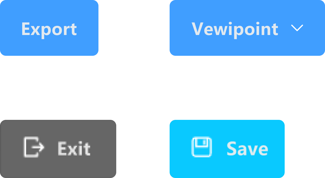
Buttons/Icons
Before
Before
After
After

After
Design System#2
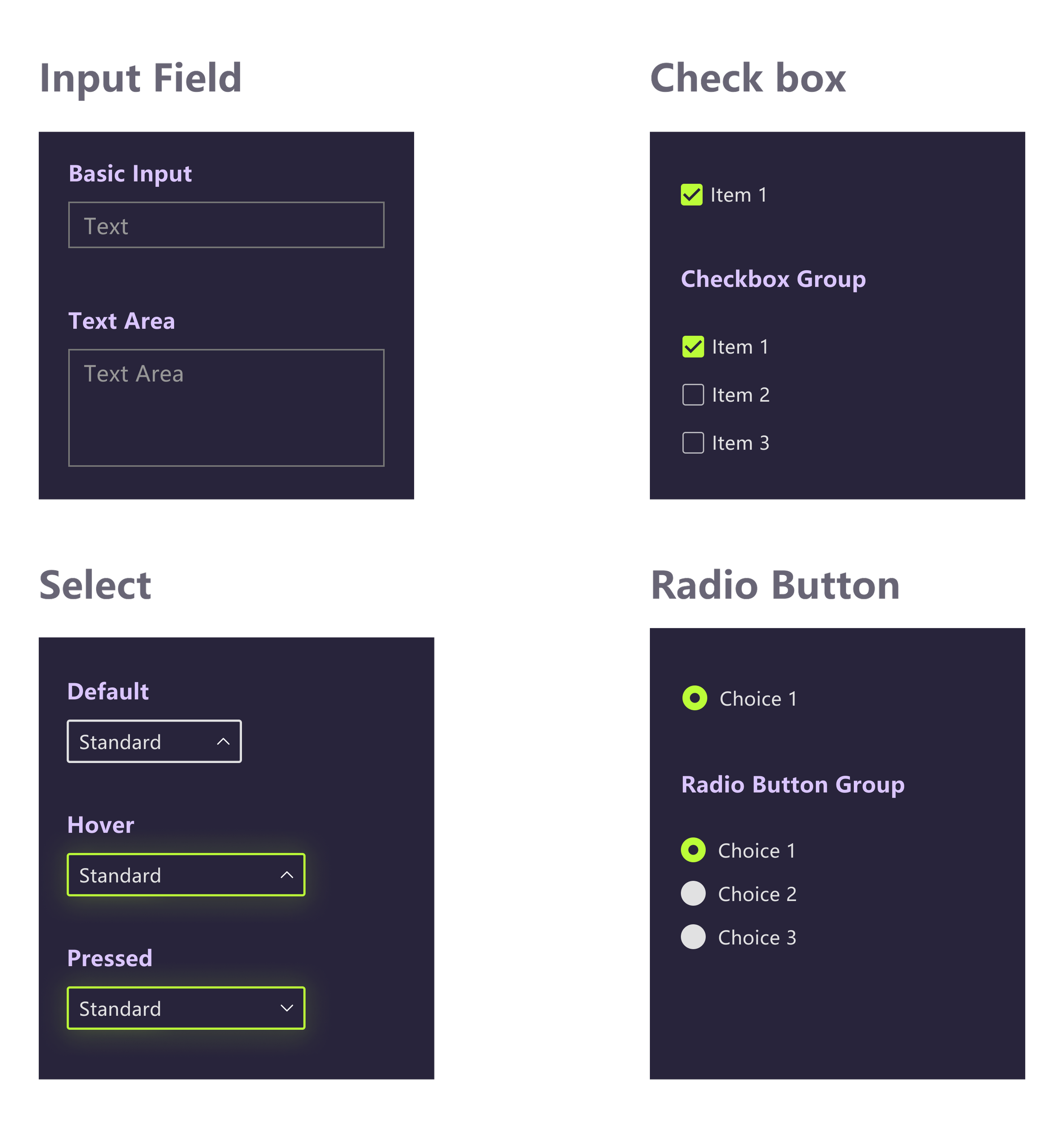
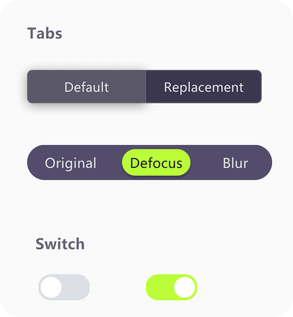
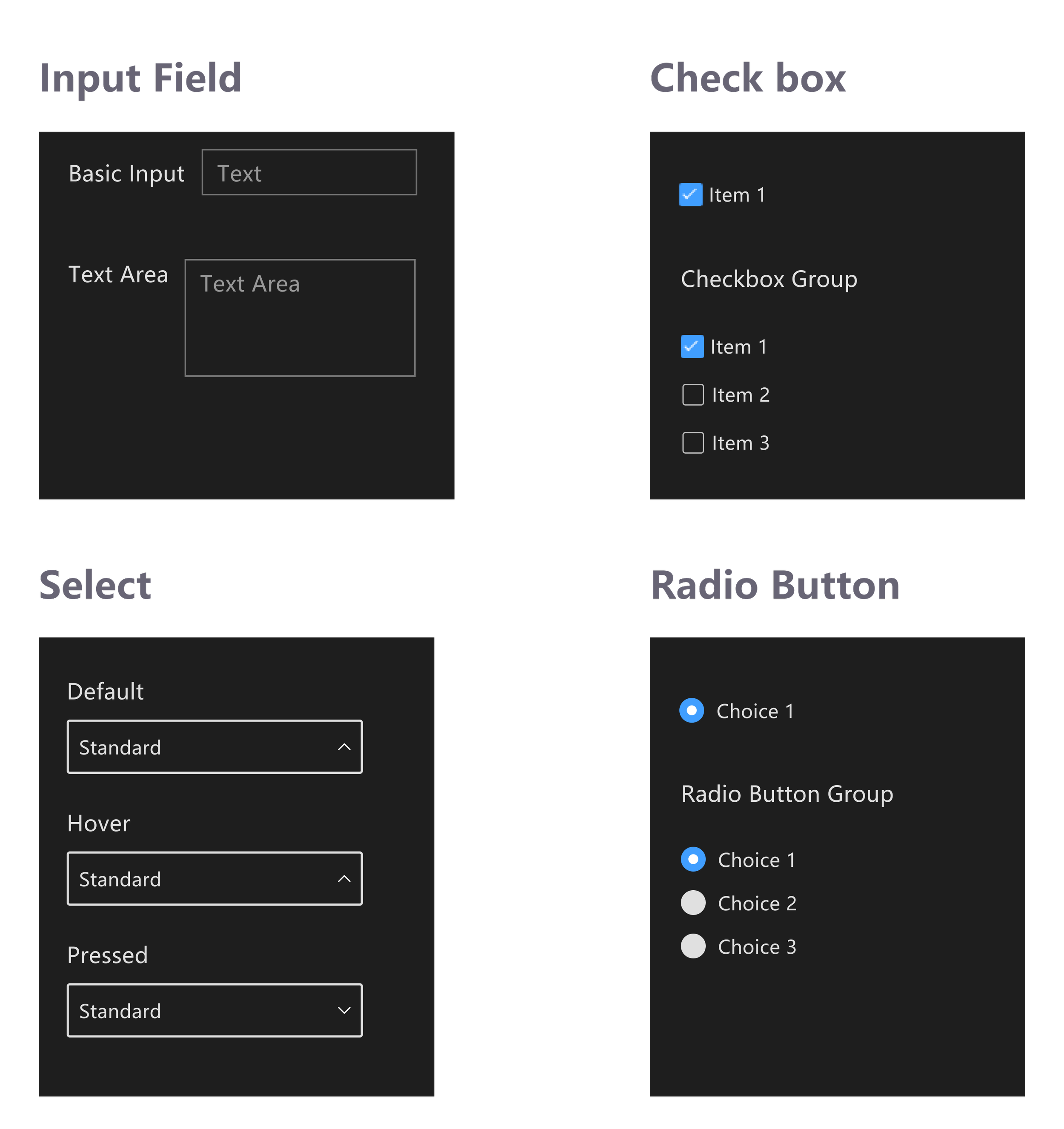
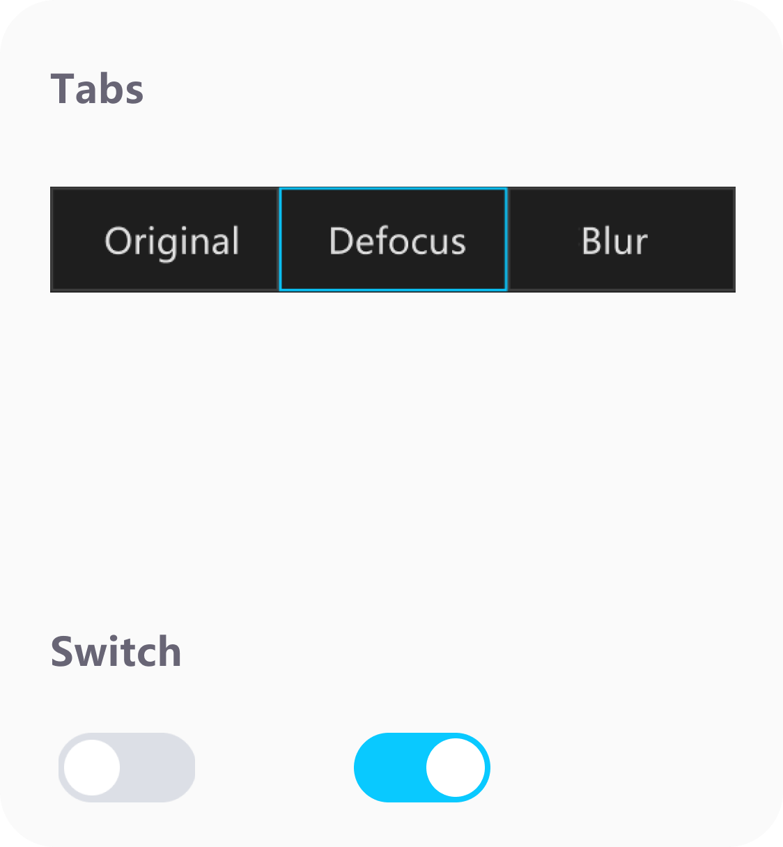
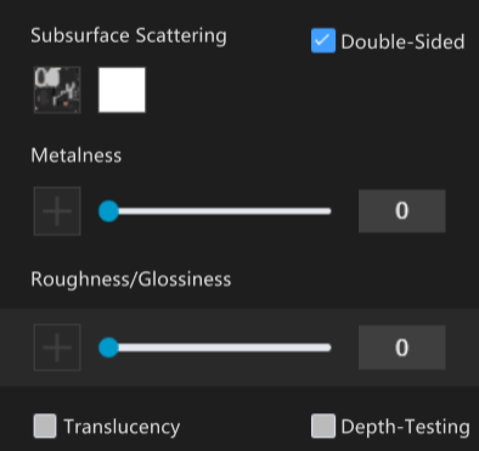
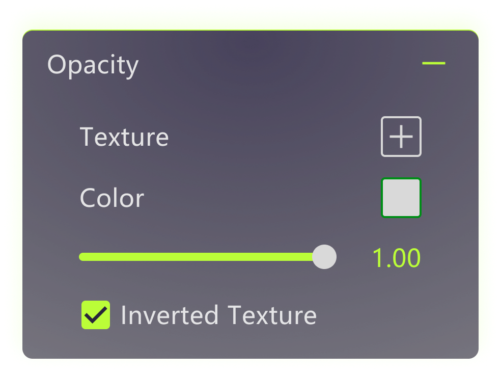
Forms/Switch/Tab
Before
Design System#3
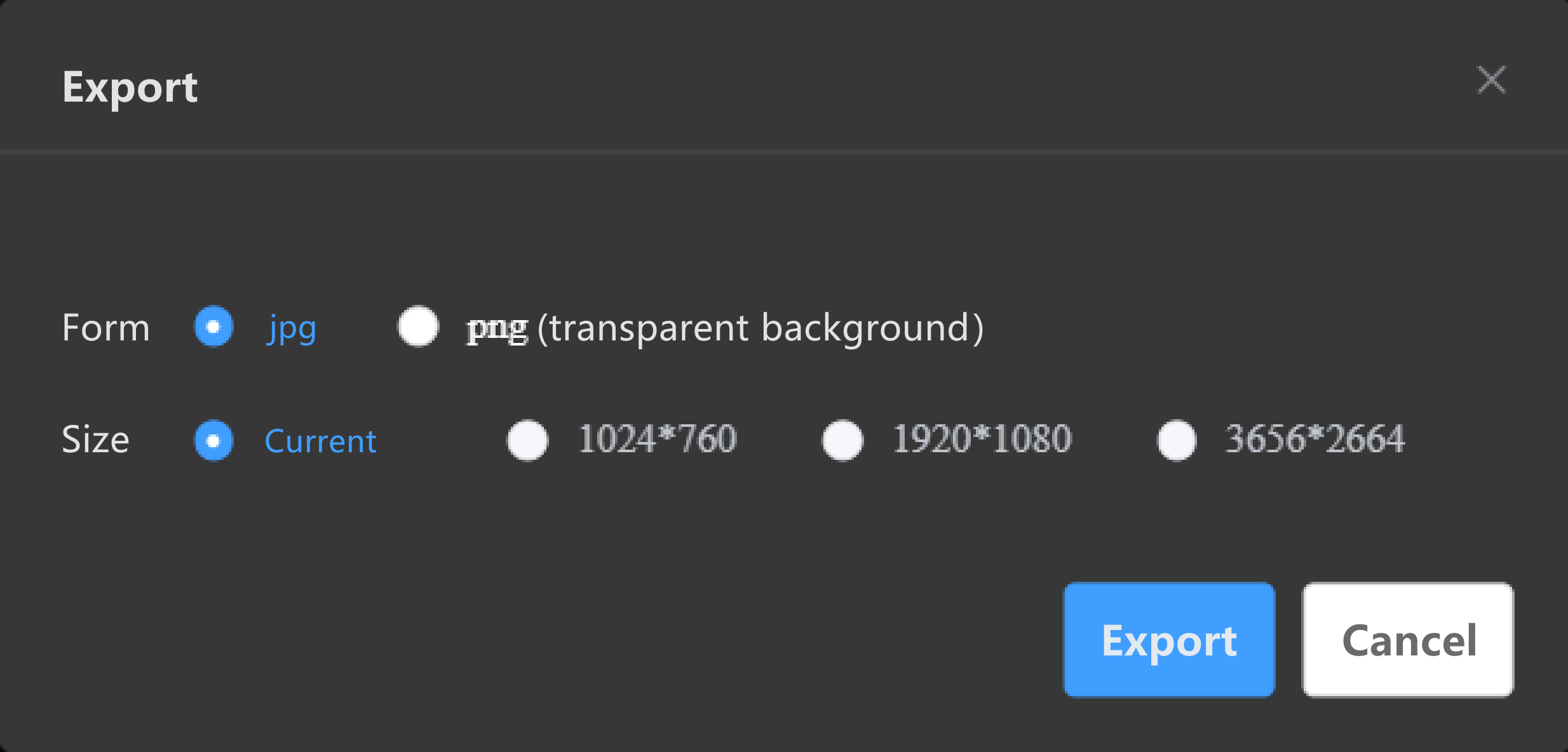
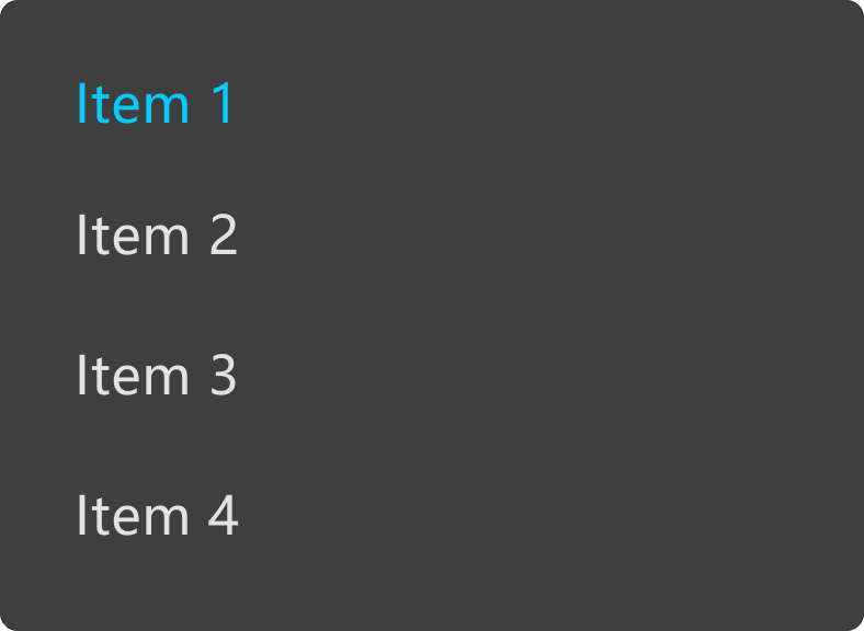
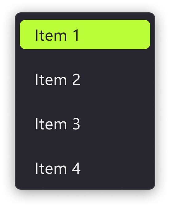
Popups/Menus
Before
After
After
Before

Impact
Reflection & Take-away
What I learned from this experience is just how important communication is within a team. As a UX designer, being able to clearly explain design thinking to stakeholders and product managers is crucial. It’s what helps balance business goals with user needs and keeps the focus on user-centered design.
Working closely with product managers and developers requires good collaboration, and solid communication ensures that everyone’s on the same page and that the design can actually be implemented in the next steps.
